Monday, February 26, 2024

These Are The Facts, And They Are Undisputed

The title of this post is taken from a line uttered by Kevin Bacon in the excellent film, "A Few Good Men." That film gave us many great lines, and this is just one of them.

The Curmudgeon is back, after a long hiatus. So biased is the national news these days that I can barely stomach watching it. I mostly watch YouTube travel videos and the NFL Network, though the latter is also biased; as a Chiefs fan, I can only say that we got our vindication this season. As safety Justin Reid said, we keep the receipts.

But I wanted to set the record straight with regard to some of the reporting that I have been hearing lately on the rare occasions that I do catch a snippet here and there of the blatant yellow journalism that has supplanted true reporting of the national news. As such, I consider this post more of an economic treatise than a political one, but interpret it as you will.

Recently, the White House and its propaganda arm, the mainstream media, have been touting President Biden's economic record. After all, they can't say much about his record on border security, crime, foreign policy, or pretty much any other policy matter. And, of course, they have to deflect the consistent reporting of the President's glaringly apparent cognitive decline. So they point to some economic success that, quite frankly, leaves me scratching my head. It calls to mind the fable of the Emperor's New Clothes.

Specifically, I've been hearing that President Biden "inherited a pandemic, and has engineered an economic recovery" therefrom.

Well, let me set the record straight; as as is my custom, I'll do it with data.

Let's start with the undisputable fact that the covid pandemic hit the United States, and the rest of the world, in March of 2020. At that time, Donald Trump was President of the United States, not Joe Biden. Thus President Trump, not President Biden, "inherited" the covid pandemic. (I won't editorialize on that pandemic's origins, or how it coincided with President Trump's re-election bid in 2020. Read between the lines as you will.)

To begin with, let's look at job growth. President Trump took office in January 2017. Nonfarm payrolls grew by an average of 180k from February 2017 to February 2020, the month before covid hit. That's a pretty healthy rate of growth.

Now, I'll concede that Trump stood by and let Fauci, Birx, et al convince most of the U.S. governors to shut down the nation's economy in response to the pandemic, which I maintain will eventually be viewed as the single worst decision ever made by policymakers in global history. That was the single worst policy decision of Trump's presidency. As a result, in just six weeks, more than 22 million jobs were eliminated in the U.S. alone, a staggering number that was unprecedented in economic history. 

President Trump was widely ridiculed for predicting that, in the aftermath of the shutdown, the U.S. economy would experience a "super-V-shaped recovery." Yet that's exactly what happened. As I've written before, the recession caused by the shutdown was unprecedented in that it was bottom-up, vs. the top-down recessions that have been typical throughout history. As such, demand remained extant.

The vast majority of Americans did not lose their jobs, and those that did not represented the highest earning levels of the economic spectrum. They still had demand for travel, dining out, shopping, and all the things they normally did when the economy was open and functioning. So when it re-opened in May of 2020 (in most states), they resumed consumption - with a vengeance, because they'd saved their largely intact incomes for two months of interrupted consumption; indeed, bolstered by government stimulus they didn't really need.

As a result, those jobs that were eliminated in the bottom echelons of the economy came roaring back. Nonfarm payroll growth from May 2020 through January 2021, when President Trump left office, totaled 12.5 million jobs, an average of 1.4 million jobs per month, which was also unprecedented in U.S. history. In other words, more than half the jobs eliminated were recovered in the nine remaining months of President Trump's tenure. It took another 17 months under President Biden to recover the remaining jobs eliminated by the shutdown. Thus President Trump did the yeoman's work of the job recovery.

Now, payroll growth under Trump following the shutdown wasn't job creation, it was job recovery - just as the job "creation" under the Biden administration has been job recovery, and we have yet to reach equilibrium in terms of recovering all the jobs that were destroyed in the shutdown plus the jobs that would have been created through normal growth had the economy never been shut down to begin with. In fact, we remain about 4 million jobs short of that equilibrium point. Such are the long-term implications of that disastrous decision to shut down the economy. Still, the point remains: job recovery in the months under Trump eclipsed those under Biden on a per-month basis.

Now, let's look at the unemployment rate. When President Trump took office in January 2017, it was 4.7%. In February 2020, before covid hit, it was down to 3.5%, about where it is now. Unemployment among nearly all minority categories was at record lows, below today's levels. In April 2020, after two months of shutting down the economy, unemployment had risen to a record 14.8%. But by January 2021, when President Trump left office, the unemployment rate was back down to 6.4%.

Are you beginning to see the picture? President Trump inherited a pandemic. Then he engineered a recovery, which his successor inherited.

Let's turn our attention to inflation, using the broad Consumer Price Index (CPI) as our measure. In January 2017, when President Trump took office, CPI year-over-year was 2.5%. By September 2019, it was down to 1.7%. When President Trump left office in January 2021, it was just 1.4%, but that was aided by the pandemic, which suppressed consumption and disrupted the supply chain.

Since that time, inflation has averaged about 6%. It's currently just over 3%, but it peaked at more than 9% under President Biden. And we have to consider the cumulative effect of today's 3% inflation rate on top of last year's 9% inflation rate. That means prices on many items are up by double digits vs. two years ago. I won't even compare what a loaf of bread, a gallon of milk, a dozen eggs, or a restaurant meal cost today to what they cost in January 2017. But I will note that a gallon of gas cost $2.30 in January 2017; $2.10 in November 2020; and is currently about $3.30.

Now, let's talk about GDP growth, the overall measure of economic output. Under President Obama, it averaged 2.2%, which is pretty anemic. Under President Trump pre-covid, it averaged 2.8%, which is quite a bit healthier. During the first two quarters of 2020 - the pandemic quarters - it averaged -18.5%, which was a record low. In fact, in the second quarter of 2020, it was an overwhelming record of -31.6%, again the result of the disastrous decision to shut down the economy.

However, in the third quarter of 2020, it was another record: +31%, nearly recovering the entire lost output of the prior quarter. The average growth rate from 2020 Q3 to 2021 Q1, when President Trump left office, was also a record, 13.4%. There's that "super-V-shaped recovery" we were promised. The average under President Biden has been about 2.8% - a healthy number, but still aided by the recovery from the pandemic (and also aided by things like people spending money on travel and consumption instead of repaying their student loan obligations, as loan delinquencies have risen precipitously). And still just back to where President Trump had gotten economic growth, so hardly a "recovery."

Next, let's examine the stock market, something the Biden administration has really been touting, because stocks have been trading at record levels. (When Trump was President, we were told by the media that stock market performance wasn't an indicator of economic health; now, it apparently is.)

Remember the dire warnings of what would happen to stocks if Trump was elected in 2016? We were told that the market would tank.

Indeed, after the election results came in late in the evening on Election Day in November 2016, stock futures sold off dramatically. Then, they began to rally. And when the market opened the next day, stocks rallied even more. As I recall, the total swing in the market from the low in stock futures overnight to the close on the day after Election Day was something like 1,300 points on the Dow, which was unprecedented.

On November 4, 2016, the S&P 500 closed at 2085. By November 9, just after the election, the index was up to 2163, a gain of nearly 4% in just five days. By February 20, 2020, just before the pandemic hit, the S&P was up to 3373, a gain of nearly 62% over when President Trump took office.

Then, after the covid shutdown, the index plunged by more than 33% to 2237 by March 23, 2020. However, by Election Day, 2020, it was 3369, up more than 50% from the pandemic low, and nearly back to the pre-pandemic high, in just eight months. Overall, it was still up about 62% from when President Trump was elected, in spite of the pandemic.

Today, it's about 5089, up about 51% from the Election Day 2020 level. Some of that is due to the continued recovery from the pandemic, a recovery that President Biden inherited. Many market observers also attribute the stock market's performance to speculation regarding the 2024 election. President Biden's poll numbers are at record lows, and President Trump is the presumptive nominee for the GOP. Given his track record during his term, the market is optimistic over the prospect of a second term. Of course, some of it is attributable to fundamentals that have nothing to do with who's in the White House: corporate earnings, interest rates possibly declining, the performance of tech stocks given the euphoria over AI, etc.

Finally, let's consider one more thing, and this one may be controversial among some of my readers: the covid vaccine. I decided some time ago not to weigh in on the various theories surrounding the vaccines. I'm not an expert in such matters (and, if you're reading this, neither are you). I only know that numbers don't lie. And I know that the economy would never have fully re-opened without the vaccines being rolled out. Beyond that, people are going to believe what they're pre-disposed to believe, and no amount of data will dissuade them. If you want to believe the world is flat, or that the lunar landing was a hoax, that's your prerogative. Suffice it to say that I've received the original vaccine and two boosters, and my heart is as healthy as it's ever been, and I have yet to develop a craving for bananas.

The CDC and the FDA are two of the most bloated and lethargic government agencies in the U.S., and that's saying something, given the slow-moving bureaucracy that is entrenched in our nation's capital. But under President Trump, those agencies fast-tracked the vaccine rollout in a way that has never been witnessed. Between April 2020 and January 2021, the vaccines were developed and made ready to distribute not just nationally, but globally, and a plan was in place to deploy them.

President Biden inherited that plan, and all he had to do was implement it. In fact, he inherited not a pandemic, as his administration claims, but a robust recovery, as the numbers above prove. He has ridden the wave of that recovery, in some instances letting it ride to new highs, as with the stock market, or nonfarm payrolls. In other instances, such as energy or overall price levels, he has placed roadblocks that have impeded progress, and even reversed the recovery that was in place prior to his presidency.

One thing is clear, however: President Biden did not inherit a pandemic. President Trump did. And President Biden has not engineered a recovery. The recovery was well underway before he took office, and he inherited that recovery.

These are the facts, and they are undisputed.

Friday, May 12, 2023

Bonds, the Yield Curve, and Recession Indicators - Part III: What the Yield Curve Tells Us About the Economy

Okay, we've covered the bond market (https://theeconomiccurmudgeon.blogspot.com/2023/05/bonds-yield-curve-and-recession.html), and we've introduced the yield curve - what determines it, what it normally looks like, how it can change, and what it generally means when it's inverted (https://theeconomiccurmudgeon.blogspot.com/2023/05/bonds-yield-curve-and-recession_9.html). Now it's time to take a deeper dive into the yield curve as an indicator of economic turning points. We'll also talk about at least one other indicator of economic downturns. But first, let's review some yield curve basics.

Below is an illustration of a normal, upward-sloping yield curve:


Next, let's review what an inverted yield curve looks like:


Finally, let's review the spread between the ten-year Treasury yield and the two-year Treasury yield, which illustrates the inversion of the yield curve (when the spread is negative - i.e., when the two-year yield is higher than the ten-year yield - the curve is inverted):


To recap, the normal yield curve is upward-sloping because we generally expect the economy to grow over the long run, so the expectations theory tells us that the Fed will be raising rates over the long run to rein in inflation. Thus, under normal conditions, and when the economy is growing (and is expected to continue to grow), the yield curve will generally be upward-sloping, with long yields higher than short yields.

It's important for us to to address why we consider this normal. The third graph above answers that question. From that graph, you can see that the yield curve is normally (most often) upward-sloping - the ten-year yield normally exceeds the two-year yield. The graph shows that the curve has only been inverted for relatively short periods of time, and those periods have been relatively few and far between.

For example, we see from the graph that the curve was inverted from the late 1970s through the early 1980s, with a couple of brief periods where the spread between the ten-year and the two-year turned positive, only to invert and become negative again. Then, the spread was positive until the late 1980s, at which point it became negative again, for a period of a couple of years. By about 1990, it was positive again, and it remained so, with the exception of a brief dip in the late 1990s, until about 2000, when the curve again inverted for a short period. The spread was positive from about 2001 until the mid-2000s, when the curve inverted once more, for about two years, again with a brief correction. After 2007, the spread was positive until 2022 (other than a very brief dip into negative territory in 2019, but only for two days, and only by 3-4 basis points).

This is intuitive. Remember that we said that an inverted yield curve has preceded nearly every U.S. recession? Well, as illustrated by the shaded bars in the third graph above, which represent recessions, there have been only six recessions in the last 47 years. (There's actually one recession shown on the graph that was an anomaly; we'll discuss it later.) Those recessions lasted, on average, less than ten months each. So for 60 out of the last 560 or so months (less than 11% of the time), we've been in recession. The rest of the time, we haven't been. So we'd say that recessions aren't the norm, and thus the normal state of the economy is growth. That supports the expectation that the economy is going to grow over the long run, and thus that future Fed moves will be to raise rates, which would make an upward-sloping yield curve the norm, according to the expectations theory.

Another critical point to make is that there has to be some reason that an inverted yield curve signals a future recession. Otherwise, it's merely a coincidence. For example, you've probably heard it said that since the 1929 stock market crash that precipitated the Great Depression, a recession has occurred, on average, every seven years. This has led some people to conclude that, when we're about six years past the last recession, "we're due for another one."

That's simply not the case. Recessions aren't like phases of the moon or solar eclipses; they're not tied to the calendar. The fact that one has occurred, on average, every seven years, is mere coincidence. The time between recessions, since the Great Depression, has varied as follows (I'm rounding to whole years):
  • Four years
  • Seven years
  • Three years
  • Three years
  • Three years
  • Two years
  • Nine years
  • Three years
  • Five years
  • One year
  • Eight years
  • Ten years
  • Six years
  • Eleven years
That averages to seven years, but as you can see, the variance is wide - from one year to eleven years. There's nothing to indicate that once the economy has grown for six years, a recession is "due," nor is there anything to suggest that the economy will grow for seven years without a recession occurring. The seven-year average is coincidental.

There are similar coincidences in the stock market. It used to hold true that if the Super Bowl winner was an NFC or original NFL team, the market would be up for the year, and if the winner was an AFC or original AFL team, the market would be down. Obviously, the winner of the Super Bowl doesn't determine the performance of the stock market; it was merely a coincidence. And it eventually broke down.

See, something has to cause a recession. It doesn't just happen. And that's a critical point in our discussion in this post.

So how does that relate to an inverted yield curve being a leading indicator of a recession? Is that mere coincidence as well?

No, it is not. In our last post, we established that the yield curve inverts because investors and traders at the long end begin to see signs of emerging economic weakness - they see signs of a recession on the horizon. And they believe that the Fed is going to start cutting rates (easing) in response to that weakness, such that in the long-term (relatively speaking), rates will be lower. So they bid yields at the long end of the curve lower to reflect those expectations, even though the Fed may still be raising rates, because the recession isn't here yet, and the economy is still growing. (And remember, we said that the Fed has a tendency to overshoot monetary policy, so it may continue tightening longer than it should.)

So there's a very good reason why the yield curve inverts prior to a recession: there are fundamental signs that a recession is coming, and traders see those signs on the horizon, and start to bid down yields at the long end of the curve accordingly.

The third graph above shows that the yield curve inverted prior to every recession since the recession of 1980. (I'm not counting the 2020 recession, nor the 2019 "inversion." I'll explain why shortly.) This validates the reliability of the inverted yield curve as a leading indicator of recessions. And it makes sense, for the reasons noted above. Bond traders and investors are pretty smart, and they watch economic data closely. So they're pretty good at seeing signs of economic weakness, and they respond to them with their trades.

Now, let's take a brief detour. Why don't I count the recession of 2020? Because it wasn't caused by any of the fundamental economic factors we normally associate with a recession. The economy in 2019 was very strong. Unemployment was at historic lows. Every economic indicator showed strength. Nobody in their right mind predicted a recession.

Then, the covid pandemic hit. And the government took the unprecedented and previously unimaginable step of shutting down the U.S. economy, causing the loss of 22 million jobs in just six weeks. Want to know what that looks like? Check out this graph of non-farm payrolls:


Look at the magnitude of the drop in 2020. It's massive.

This was a bottom-up recession, as I discussed in this blog at the time. That's never happened before; recessions tend to be top-down, with jobs at the top of the economy (i.e., the highest earners) being lost first, and that trickles down to lower-paying service sector and retail jobs. The covid shutdown eliminated the service sector and retail jobs - retail stores, hotels, restaurants, etc. Earners at the higher end of the pay spectrum kept their jobs, for the most part. (That's the primary reason the recovery was so rapid.)

So I discount the 2020 recession because it was an anomaly. Unlike every other recession, which have been naturally occurring, the 2020 recession was manufactured - it was forced upon us, by the government shutting down the economy, not by the economy encountering fundamental weakness and contracting.

Likewise, I discount the "inversion" that occurred in 2019 because that, too, was an anomaly. Again, nobody anticipated the 2020 recession. Nobody saw covid coming (except maybe Anthony Fauci, and he's not smart enough to be a bond trader). Also, as noted above, the two-year yield only exceeded the ten-year yield for two days in September 2019, and by only 3-4 basis points. It was more of a flattening of the yield curve than a true inversion. It happened because the bond market began to speculate that the Fed had once more overdone a series of rate hikes between 2016 and 2019, which sparked fears that higher interest rates could potentially slow the economy.

Those fears proved to be unfounded; jobs grew by about a million in the five months from September 2019 to February 2020, and every other economic indicator was strongly positive. You can see from the 10-year/2-year spread graph how quickly the bond market realized the fallacy of its fears. (Also, the Fed began cutting rates about three weeks before the 10-year yield dipped below the 2-year yield, helping to allay fears that the Fed was going to choke off growth, and Fed officials were signaling that there were more rate cuts to come.)

Okay, so we've established that recessions happen for a reason (except for the 2020 recession - well, it happened for a reason, but not a naturally-occurring one), and that there's a good reason that an inverted yield curve is a leading indicator of a recession, based on bond market expectations. So what's all this about a false notion about the yield curve as an indicator of recessions?

There is a theory - actually, it's more of a notion, and really it's a misconception - that while an inverted curve does precede a recession, it's not a great indicator of an imminent recession, because the curve often inverts well before recession ensues. That's true. For example, the curve inverted 17 months before the 1980 recession; 19 months before the 1990 recession; 13 months before the 2001 recession; and 16 months before the 2007 recession (it briefly inverted before that, then corrected before inverting again). But some investors try to time the market (with little success), so they want to know exactly when a recession is going to start. Just knowing a recession is coming isn't good enough for them.

So in an effort to meet that need, proponents of this notion argue that a better indicator of an imminent recession is the "uninversion" of the yield curve. Again looking at our graph of the 10-year/2-year spread, they argue that the yield curve "uninverted" prior to the recessions in 1990, 2001, and 2007. They also use the flattening of the curve in 2019 as an example of an inversion, and claim that the curve subsequently "uninverted" before the 2020 recession. These "uninversions," they argue, occurred just three months before the 1990 recession; two months before the 2001 recession; six months before the 2007 recession; and five months before the 2020 recession. On the basis of their observations of those four recessions, they claim that the yield curve has "uninverted" just prior to every recession.

Let's unpack this notion. First, who are the people who promote this idea? They're not economists; I haven't seen or heard one economist put forth this idea. And they're certainly not in the bond business. I spent four years trading, managing and hedging bonds on the buy side, and 21 years on a bond desk as an investment advisor, running an advisory desk, as an economist, and as CEO of a bond sales and advisory firm, and I never once encountered this notion.

In fact, not once in those 25 years did I ever come across the term "uninversion." When the yield curve is no longer inverted, we don't say that it "uninverted." At least no one who knows anything about the bond market uses that term. Since the normal state of the curve is upward-sloping, when the curve returns to that shape, we say that it "reverts" to normal, just as in statistics we say that after a certain data series undergoes an anomalous period, it reverts to the mean, or to its normal state.

For example, the pace of home price appreciation in a given market is mean-reverting. When something happens that results in the pace of home price appreciation exceeding the long-term mean in a given market - like historically low interest rates - there will inevitably be a correction. That happened after the early 2000s, when then-record low mortgage rates resulted in rapid home price appreciation that resulted in a historic housing bubble, which burst in 2007, resulting in a massive correction before home price appreciation reverted to the mean. It happened again in 2021 and 2022, when again record low mortgage rates fueled a home price bubble, which is now correcting as price appreciation is reverting to the mean.

So any knowledgeable economist or bond trader or investor would say that an inverted curve reverts to normal. As far as I can observe, the people that use the term "uninversion" and promote this theory fall into four camps: 1) some fringe equity fund managers and equity-centric investment advisors who don't understand the bond market; 2) people who write those far-out investment blogs that promote conspiracy-esque theories like the GameStop and AMC stock aficionados; 3) business journalists (and I believe I've already established how knowledgeable they are); and 4) people on social media who follow those in the first three camps, and don't know anything about the bond market or the yield curve, but want to sound like they know something the rest of you don't know.

Okay, so back to their "theory." It kind of looks like it's valid. Is it?

Well, first, note that they conveniently ignore the 1980 recession, which began while the curve was still inverted. Likewise, they ignore the 1981 recession, which also began while the curve was still inverted. Now, if they were smart, they'd try to argue that those recessions occurred before the monetarist era was really underway. Only a) that's a disconnect; it would have nothing to do with why those recessions ensued while the curve was still inverted, and b) it would be incorrect, because the monetarist era began in 1979, and c) they don't know what the monetarist era is, which is probably why they don't attempt to make that argument. In any event, by excluding those recessions, their claim that every recession has been preceded by an "uninversion" falls flat.

The fact of the matter is, they exclude those recessions because they don't fit their pattern.

They also include the 2020 recession, and the 2019 flattening as an "inversion." But the curve didn't meaningfully invert, nor can we argue that it reverted to normal, in 2019, and again, nobody could have seen the 2020 recession coming, so that doesn't hold water. They only include those anomalies because, again, including them supports their pattern.

Also, they've been arguing recently that the curve is once again on the precipice of "uninverting." Every time there's a move in bond yields that results in the curve becoming less inverted (i.e., the spread between the 2-year and 10-year yields narrowing), they claim that "uninversion" is just around the corner, and that when that happens, a recession is imminent. In other words, they tend to be doomsayers. And I'll comment on doomsayers in a few minutes.

The problem with the claim that the inverted yield curve is about to become "uninverted" is that it simply isn't true. The curve is currently inverted by about 47bp. In early March, before the failure of Silicon Valley Bank and Signature Bank, it was inverted by nearly 90bp. But the panic over those bank failures led to a flight to quality, which led to a flurry of bond-buying that resulted in lower yields on the two-year relative to the ten-year, and that resulted in the spread between the two narrowing. However, the curve has been inverted by at least 40bp since last October, and the inversion has averaged about 50bp for the two months since those bank failures. It would take a massive move in Treasuries for the curve to no longer be inverted. And the people who push this notion are the same people who argue that large moves in Treasury yields rarely happen, so they contradict themselves.

(I should also note that these same doomsayers claimed that those bank failures signaled a systemic banking crisis in the U.S.)

The thing about doomsayers is this: if they make their claims long enough, eventually they may turn out to be true. In other words, if they keep saying a recession is imminent, eventually, there will be a recession. Then, they'll say, "See? I told you so."

Just as there has to be a reason that the curve inverts before a recession, there would have to be a reason that it reverts to normal (or "uninverts," in the lexicon of the uninformed) immediately before a recession, for that to be a reliable indicator. And the proponents of this "theory" can't point you to one.

Well, I can tell you why the curve reverted to normal prior to the recessions in 1990, 2001, and 2007:

The Fed had already begun easing before those recessions began.

In June 1989, the Fed began cutting the Fed funds target, after having raised it by about 400bp over the previous two years. By the time the 1990 recession began, they had cut the funds target by more than 150bp. However, it wasn't enough, and the recession hit in July 1990 (largely brought on by the S&L crisis of the 1980s).

In January 2001, the Fed cut the funds target by a whopping 100bp in one move (they normally move 25bp at a time), but that wasn't enough either; the recession began in March, as a result of the dot-com bubble bursting. And in September 2007, they again cut the target rate by a larger-than-normal 50bp, and continued easing, but it once again was insufficient to prevent the recession that began in December, which resulted from the housing crisis.

In all three of those cases, as soon as the Fed began easing, or signaled that it would, bond traders began bidding up long-term yields, and bidding down short-term yields, and the curve reverted to normal.

And the reason the recessions of 1980 and 1981 began while the curve was still inverted is because the Fed was still increasing rates at that time. Volcker raised the funds target from an average of just over 11% in 1979 to 20% in June 1981. The 1980 recession began in January, and the 1981 recession began in July. Those recessions happened largely because the Fed raised short-term rates so high.

So the yield curve reverts to normal when the Fed begins easing, not when a recession is imminent. It may be a coincidence that the Fed begins easing when a recession is imminent, if their timing is right. But a better indicator that a recession is imminent is that the Fed begins easing, not that the yield curve "uninverts." That's just coincidental poppycock.

The yield curve will not revert to normal because of movements in bond yields per se. Recent large movements have been primarily due to irrational fears over the banking sector's health. For example, on March 13, there was a sizeable move in bond yields that brought these "uninversion" proponents out of the woodwork and had them proclaiming that the curve was "uninverting" rapidly, and thus recession was nigh. Guess what precipitated that move in bonds on March 13?

Signature Bank failed on March 12, two days after Silicon Valley Bank failed.

The yield curve will revert to normal when and if the Fed begins easing, and then you can bet a recession will be just around the corner - not because the yield curve reverted to normal, or because the Fed started easing, but because of economic weakness that has been emerging for quite some time, as the bond market has seen coming since the curve inverted last July. The Fed will begin easing because of that weakness, not vice-versa.

Now, one last mythical notion that I've recently seen regarding recessionary signals. Some of these same folks have claimed that "unemployment is a lagging indicator, because it tends to peak after a recession has ended."

Well, the second part of that statement is true. The unemployment rate peaked after the end of nearly every U.S. recession since WWII (the peak in unemployment coincided with the ends of the 1948-49 recession and the 1980 recession, and I'm not counting the 2020 recession, though the peak coincided with the end of that anomaly, too). However, the graph below shows that an increasing jobless rate was a leading indicator of the recessions that began in 1948, 1953 (barely), 1957, 1960, 1973 (again, barely), 1980, 1990 (barely again), 2001, and 2007 (and I'm not counting 2020, because the economic shutdown was what caused unemployment to skyrocket that year). It was a coincident indicator of the recessions that began in 1969 and 1981, and if you want to say it was a coincident indicator of the recessions that started in 1953, 1973, and 1990, I'm okay with that, too.


Anyone who understands economics knows that for an indicator to be leading, concurrent, or lagging, we don't look at when it peaks, we look at when it signals a turning point. In other words, you look at the leading edge, not the trailing edge. And the graph above clearly shows that the unemployment rate has never been a lagging indicator.

Now, we've established that the yield curve is signaling a recession. However, the unemployment rate just fell from 3.5% in March to 3.4% in April. So can a recession really be on the horizon, if the labor market is strong?

This is why I've always looked at "the numbers behind the numbers." Consider these other facts about the labor market:
  • The only reason the unemployment rate declined in April was because the labor force declined. Besides normal retirement, people typically exit the labor force for one of two reasons: their employers incent them to, or they become discouraged with their prospects for employment. In the former case, companies incent people to leave the labor force in order to trim their payrolls, in advance of outright layoffs. In the latter case, it means people are having trouble finding suitable jobs that match their skills.
  • Non-farm payroll growth is decelerating, and the February and March numbers were revised lower.
  • Job openings have declined by about 2.5 million over the last year. That's equal to the decline experienced when the government shut down the economy in response to the pandemic; it just took longer. The last two job openings reports have been significant downside surprises.
  • Temporary jobs have declined for three consecutive months. Companies tend to cut temp jobs first, before laying off permanent workers.
  • The average workweek has declined steadily since the beginning of 2021. Besides cutting temp jobs, companies cut overtime in advance of cutting jobs outright.
So there are definitely cracks in the labor market. (These are just some of the signs that the bond market was seeing back in July of 2022, when the yield curve began to invert.) And we're not in recession yet. Thus labor is very much a leading indicator of recessions.

For anyone who's suffered through all three of these posts, kudos. I hope it's been informative, and educational. And I hope it's dispelled any myths you may have seen floating around about what is and is not an indicator of an imminent recession. Remember, there has to be a reason that something is a recessionary signal; otherwise, it's just a coincidence, like which conference's team won the Super Bowl.

Tuesday, May 9, 2023

Bonds, the Yield Curve, and Recession Indicators - Part II: the Yield Curve

Now that we're armed with a basic understanding of bonds and the various Treasury debt maturities, let's talk about the yield curve. (In case you missed the primer on bonds, it's here: https://theeconomiccurmudgeon.blogspot.com/2023/05/bonds-yield-curve-and-recession.html) First, let's recap the Treasury maturities:

  • 1-month Treasury bill, or T-bill
  • 3-month T-bill
  • 6-month T-bill
  • 1-year T-bill
  • 2-year Treasury note
  • 3-year note
  • 5-year note
  • 10-year note
  • 20-year bond
  • 30-year bond
(As a reminder, we'll be using the word "bond" to describe both notes and bonds, as all of these instruments make up the bond market, but technically, the 2-10 year instruments are called notes.)

If we were to graph the yields on those maturities, with time to maturity on the horizontal, or x, axis, and yield on the vertical, or y axis, we'd have a picture of what we call the yield curve. Since the intervals between the times to maturity aren't uniform (e.g., there's only a two-month gap between one and three months, but there's a 10-year gap between 20 and 30 years), the graph is typically represented with the points in between those maturities interpolated step-wise, to illustrate what the yields would be on, say, an outstanding bond with a remaining maturity of 14 years. Don't get hung up on that point; just look at the illustration below.

Since yields change daily (actually, they change throughout the trading day), any graph of the yield curve will be as of a specific point in time. Here's a graph of the Treasury yield curve using closing yields (as of the end of the trading day) on April 1, 2021:


Note that the lowest yield on the curve is the yield on the one-month T-bill, and the highest yield is the yield on the 30-year bond. This is typically the case: short-term yields are generally lower than long-term yields. (We'll discuss why momentarily.) This is what we'd call a "normal" yield curve - it's upward-sloping, left to right, or short-term to long-term.

So why are short-term yields lower than long-term yields? This is referred to as "the term structure of interest rates," or "the term structure of yields." There are three theories that explain the term structure. They're all valid; each plays a role. Let's address them in turn. (Note to my finance geek friends: I realize that the term structure generally refers to the spot and forward curves, rather than the coupon curve; I'm over-simplifying here for the lay reader. I'm not going to get into spot, forward, or swap curves.)

Liquidity Preference Theory

This theory is perhaps the most intuitive. If you have a regular savings account, you can withdraw your money at any time, without penalty. If you want to withdraw funds from your savings account tomorrow, you can do so; if you want to park it there indefinitely, you can do that, too. If you need the money seven weeks from now, you just withdraw the money from your account.

On the other hand, if you have a certificate of deposit (CD), it has a fixed maturity date, like a bond. (As with bonds, there are structured CDs, like callable CDs, but we won't get into that.) If you leave the money deposited in the CD until that maturity date, you'll earn the stated interest rate. But if you try to withdraw it early, you'll pay a penalty, effectively reducing your interest.

Now, why on earth would you tie up your money, let's say for a year, in a CD, when you could just deposit it in a regular savings account and have access to it whenever you want?

If your answer is that you'd earn a higher rate of interest for putting the money in the CD, go to the head of the class - that's the full-credit answer. And you'd expect a higher rate on a five-year CD than on a one-year CD, right? Because you wouldn't have access to the money for five years, vs. being able to withdraw it in a year. The reason you might prefer the one-year CD is that you're not sure whether you'll need the money a year from now, and you're not confident you won't need it for the next five years.

(Another reason might be that you're not sure what rates will be a year from now, and you don't want to tie up your money for five years in case rates are higher in a year, at which time you could take the funds from the maturing one-year CD and deposit them in an account earning even higher interest, but that gets into another theory of the term structure.)

According to bankrate.com, current rates on regular savings accounts range from as low as 0.01% to more than 4.00% for some online banks, but most local brick-and-mortar institutions are going to offer less than 1% currently on regular savings accounts.

One-year CD rates, again per bankrate.com, currently range from 4.75% to 5.10%. This validates the concept that the bank will pay you a higher rate of interest to let them use your money for a full year, without the risk that you'll withdraw it unexpectedly, than they'll pay you for money that you can withdraw at your discretion.

The same concept applies to the term structure of interest rates. The theory is that investors prefer liquidity, meaning they'd rather have access to their funds sooner than later. Except instead of "lending" money to a bank, the investor is "lending" money to the U.S. Treasury. So under normal conditions, we as investors expect a higher rate of interest if we're buying a 2-year Treasury note than if we bought a 3-month T-bill; in the former instance, we don't get our principal back for two years, while in the latter, we have access to our funds in three months. (We could sell the 2-year note in three months, but it might be worth less than par, depending on market yields and thus bond prices in three months - the only way we can be certain we're going to get par at redemption is to hold the note to maturity.)

Likewise, we expect a higher rate of interest on a 5-year note than on a 2-year note; an even higher rate on a 10-year note; and even higher rates on a 20-year or 30-year bond, respectively. Thus, the lowest rates will be paid on those Treasury instruments with the shortest maturities (providing us with the greatest liquidity), and the highest rates will be paid on the longest (least liquid) maturities. We're talking about liquidity here in terms of return of par value at maturity, not how easy it is to sell Treasuries. Also, note that this is a theory; it's generally true, under normal conditions, and that's why a "normal" yield curve is upward-sloping.

In summary, investors have a preference for liquidity, and are willing to accept lower yields for greater liquidity (shorter maturities), but expect higher yields for less liquidity (longer maturities). That preference plays a role in determining the term structure of interest rates.

Market Segmentation Theory

If you have a basic understanding of economics, you know that the laws of supply and demand are immutable. And the greater the demand for something, the higher the price is likely to be. (Technically, I should say the greater the quantity demanded, but let's not get technical. I'm just making the distinction in case there are any budding economists reading this.)

And, as we've established, the higher the price of a bond, the lower its yield. So, the greater the quantity demanded of a given maturity, the lower the yield is likely to be, because the price will increase as the quantity demanded goes up. (Again, this is under normal conditions.) And the less the quantity demanded of a given maturity, the higher the yield is likely to be, because lower demand puts less upward pressure on prices. Looking at that last point another way, if there's less demand for a given maturity, the issuer may have to pay a higher rate of interest to get investors to purchase bonds of that maturity.

Short-term Treasury bills are used by corporations as cash management instruments. There are thousands of U.S. corporations. (Global companies buy U.S. Treasuries, too.) And many of those corporations are massive: the largest U.S. company by market capitalization is Apple, with more than $2.7 trillion in market cap. (Market cap is the value of a company's stock price times the number of shares outstanding.) So if you add up all the companies in the U.S. (actually, the world), and consider the fact that they all have demand for short-term T-bills, it's pretty easy to figure out that the demand for T-bills is going to be massive. Thus, the yield on T-bills is going to be low.

Banks and credit unions tend to invest in Treasury notes, generally in the two- to five-year maturity range. As noted in a previous post, there are more than 4,000 banks in the U.S. and about the same number of credit unions. The total assets of all those institutions combined is about $25 trillion. So there's a lot of demand for medium-term T-notes as well, but not as much as for T-bills. So the yield on those notes is going to be higher than the yield on T-bills.

(Certain insurance companies, like property insurers, also invest in intermediate term notes. Those companies account for about another trillion dollars in size. Also, a number of corporations invest in intermediate maturities as well.)

Life insurance companies generally invest in long-term bonds, because their liabilities are long-term. (A life insurance company's liabilities are the policy amounts they have to pay out when a policyholder dies, so in the case of your life insurance company, you'd better hope their liabilities are long-term.) There are less than 750 life insurance companies in the U.S. The face amount of total life insurance in force is about $20 trillion.

The market segmentation theory holds that there's much greater demand for short-term T-bills, not because of liquidity preference but because of the types of investors that buy them. There's less demand for medium-term notes, and there's even less demand for long-term bonds. Thus, since the highest demand => the highest price => the lowest yield, and so on, yields on T-bills will be lowest, yields on medium-term notes will be higher, and yields on long-term bonds will be the highest, because there are fewer investors in that segment.

(Sidebar: in case you're curious about why banks and property insurers buy medium-term notes, it's similar to the reason that life insurance companies buy long-term bonds: they're matching the average maturity of their liabilities.)

Expectations Theory

The expectations theory is the biggest driver of the term structure of interest rates. It holds that long-term rates are based on expectations of where short-term rates will be in the future. (Note: just as I'm using the terms "bonds" and "notes" somewhat interchangeably, I'm doing the same with "rates" and "yields." My finance geek friends are no doubt grinding their teeth at this; however, if they'd ever worked on a bond trading desk, they'd hear those terms interchanged pretty regularly.)

Let's explain why this is true. Let's say I'm considering buying a ten-year bond. I should be indifferent between buying the ten-year T-note, or buying a one-year T-bill and rolling it over at maturity nine times, for ten years in total. Otherwise, I could execute an arbitrage trade (don't get hung up on that term; it basically just means taking advantage of market inefficiencies). If I'm better off buying the ten-year than rolling the one-year, I could buy the ten-year, sell the one-year short and roll that trade, and pocket the profit. If I'm better off buying and rolling the one-year, I could do the converse. Since we assume that the bond market is efficient and such arbitrage opportunities don't generally exist, we make the assumption that investors are indifferent between buying the ten-year, and buying and rolling the one-year.

If that's the case, then the ten-year yield represents investors' expectations of the one-year yield, ten years forward. It's a similar case for the 30-year yield: it represents expectations of the one-year yield, 30 years forward; the five-year yield represents expectations of the one-year yield five years forward; etc.

This explains why a "normal" yield curve is generally upward-sloping. Investors generally expect that short-term rates will be higher in the future. Why is this?

In answering that question, we're going to start veering away from the theories behind the term structure (though the expectations theory will remain a part of the discussion), and get into Fed policy, economic cycles, and how the yield curve changes in response.

Investors generally assume that over the long run, the economy is going to grow. Sure, there will be downturns, but the long-term trend is expected to generally be upward.

Also, short-term rates are generally controlled by the Federal Open Market Committee (FOMC) of the Federal Reserve. (Instead of that cumbersome reference, I'm just going to use the term, "the Fed.") I'm going to explain in some detail how they do that, but I'm not going to give it a comprehensive treatment; the Fed has a number of policy arrows in its quiver that it can use to achieve its objectives.

The Fed is responsible for two key policy mandates: controlling inflation, and maintaining full employment. To some extent, these mandates are at cross-purposes. Inflation generally occurs when the economy is growing too fast. Prices are rising due to increasing demand that results from people being flush with cash to spend; wages are increasing because companies are expanding and hiring more people; etc. And all that demand for goods, services, and labor is driving up costs and prices.

On the flip side, stable employment is threatened when the economy is contracting. Companies cut jobs as they anticipate weaker economic conditions. As they forecast lower sales (i.e., less demand for goods and services), they start to trim payrolls, beginning by cutting hours and temporary help, and then by cutting jobs outright.

So the Fed has to walk a tightrope between stimulating the economy such that employment doesn't fall significantly, but not stimulating it so much that growth becomes so strong that inflation results. How does it do that?

Prior to the 1980s, the Fed manipulated the money supply to achieve its policy objectives. It pumped more money into the economy when it wanted to stimulate it, and it withdrew money from the economy when it wanted to slow it down. Pretty simple.

Then, in 1980, three things happened. President Carter had just appointed a hard-nosed economist named Paul Volcker as Chairman of the Fed in 1979. At the same time, inflation had been rampant throughout the 1970s, averaging more than 7% per year, and reaching as high as 13% by the end of 1979 (after averaging around 2% throughout the previous decade). And third, Congress passed the Depository Institutions Deregulation and Monetary Control Act (DIDMCA) in 1980. Prior to the passage of DIDMCA, loan and deposit rates were fixed by the Fed; the Act allowed those rates to float with market rates.

In the aftermath of those three events or trends, Chairman Volcker began using a different set of policy tools to meet the Fed's objectives: he manipulated short-term interest rates, instead of using the money supply. To curb rampant inflation, Volcker immediately began to aggressively increase two key benchmark rates the Fed charged banks: the discount rate, and, more importantly, the Fed funds target rate. (The Fed funds target also determines the rate that banks charge each other to borrow and lend from and to each other to facilitate their liquidity needs.) Those rates determine other key rates, including the prime lending rate, which banks charge their most creditworthy customers. Most credit card rates are still tied to the prime rate. And the Fed funds rate also influences Treasury yields.

Since the Fed funds rate is basically an overnight borrowing rate, it's analogous to a regular savings account rate, but between banks, rather than for individual depositors. It's closely watched by market participants. Treasury yields are based in large part on expectations of what the Fed funds rate will be in the future.

We need to address how the Fed uses the Fed funds target to effect monetary policy. Recall that prior to DIDMCA, the Fed increased the money supply to stimulate the economy and promote full employment, and it decreased the money supply to rein in an overheating economy and thereby slow the rate of inflation.

In the time since the passage of DIDMCA (what we call "the monetarist era," which is still in place today, since the Fed still uses interest rates to effect monetary policy), the Fed increases the Fed funds target to slow down an overheating economy. This has the same effect as reducing the money supply, in that it makes borrowing more expensive. Businesses would be less likely to borrow and expand, so hiring would slow and wage growth would decelerate. Consumers would also be less likely to borrow and spend, so demand for goods and services would decline, thereby reducing the risk of inflation. (I'm only talking about the Fed funds target here, and not addressing the discount rate. The discount rate is important, but the markets focus on the Fed funds target.)

Conversely, when it sees signs of economic weakness, the Fed begins cutting the Fed funds target. The intent is to get businesses and consumers borrowing to stimulate the economy, thereby promoting full employment. (The Fed's definition of "full employment" is a moving target, but recent Fed Chairmen have defined it as a 5% unemployment rate. Obviously that's not "full" employment, but some people are always going to be unemployed at any given point in time, and historically, 5% is a pretty low unemployment rate.)

The Fed engages in these cycles of cutting rates ("easing") and raising rates ("tightening" or "hiking") proactively - or at least it attempts to. More often than not, the Fed gets it wrong, and especially over the last 25 years or so, they have a tendency to overdo it. They cut rates by too much and leave them too low for too long, and thus create asset bubbles that result in recessions. This happened in 2000 with the dot-com bubble and in 2008-09 with the housing bubble. (They created another housing bubble in 2021-22 that is currently in the process of correcting.) And they tend to get behind the market when it comes to raising rates, as they did in 2022 when inflation began to accelerate; as a result, they had to tighten more aggressively than they have since inflation was last this high, in the 1980s. However, a critique of Fed policy and its contribution to asset bubbles is another topic for another day.

Where is all this leading us in our discussion of the yield curve? The short end of the curve (under two years) tends to react to Fed moves, while the long end of the curve (especially the ten-year) anticipates longer-term future Fed moves. We'll talk more about that momentarily. First, let's talk about why the expectations theory means that a "normal" yield curve is upward-sloping. Then, let's address why certain maturities receive greater focus than others, something I alluded to in the previous post.

In general, as noted above, the market expects that the economy will grow over the long run. That means that the Fed will have to raise rates over the long run in order to keep inflation at bay, and that in turn means that long-term expectations of future interest rates will be higher than short-term rates are today. Thus long-term yields will be higher, based on those expectations, than short-term rates, and the yield curve will slope upward from shorter to longer maturities. Again, that's generally true, and only when the economy is growing.

Now let's turn to why certain maturities are more "important" than others. When we talked about the market segmentation theory, we noted that banks and credit unions tend to focus on the two- to five-year maturity range, thus those maturities are considered key benchmarks. Two years is about the average duration of a car loan, and many institutions maintain a similar duration for their investments, including Treasuries. And, looking at a typical graph of a "normal," upward-sloping yield curve, the five-year point on the curve tends to be an approximate inflection point, at which the long end of the curve begins to flatten out.

And finally, the ten-year yield is the benchmark yield for mortgage loans, because that's the approximate average duration of a 30-year fixed-rate mortgage loan. (Mortgages are priced at a spread to the ten-year yield for that reason.) Also, not that many investors, relatively speaking, invest in 20- to 30-year maturities. So 2s, 5s and 10s are considered the key maturities by bond market participants.

When the Fed raises rates, the two-year yield is almost always going to go up. The ten-year yield may go up, as long as traders and investors at the long end believe that future Fed moves will be to raise rates. However, if traders and investors believe that the Fed is done raising rates, or almost done, and that they're going to start cutting rates again soon, the ten-year yield may go down immediately after the Fed raises the Fed funds target. This is because, again, short-term rates react to the Fed, while long-term rates anticipate longer-term, future Fed moves. If the long end (meaning traders of long-term Treasuries) believes future moves will be lower, it will bid yields down based on those expectations.

As a result - and this is where we begin to get into a discussion of what the yield curve tells us about the economy - if the long end believes that the economy is weakening, and the Fed is going to have to start cutting rates longer-term, it will bid yields down: long-term yields will begin to fall in anticipation of those future Fed rate cuts. But if, at the same time, the Fed is still raising rates, because that economic weakness has not yet emerged, short-term rates may continue to rise in response to the Fed raising rates.

And that can lead to a yield curve that is the opposite of what we'd normally see, where long-term yields are lower than short-term yields. This runs counter to the liquidity preference and market segmentation theories, but is entirely in line with the expectations theory: the market expects the Fed to reduce rates long-term, but to continue to raise them short-term. The result is what we call an inverted yield curve:


In this graph, as of a few days prior to this writing, we see that the highest yield on the curve is the yield on the one-month T-bill, and the lowest yield is that on the five-year note. Even the 30-year bond yield is less than any of the T-bill yields, because long-term traders and investors expect the Fed to begin easing soon, because of emerging economic weakness. This is in spite of the fact that, the day after the date of this graph, the Fed increased the Fed funds target rate.

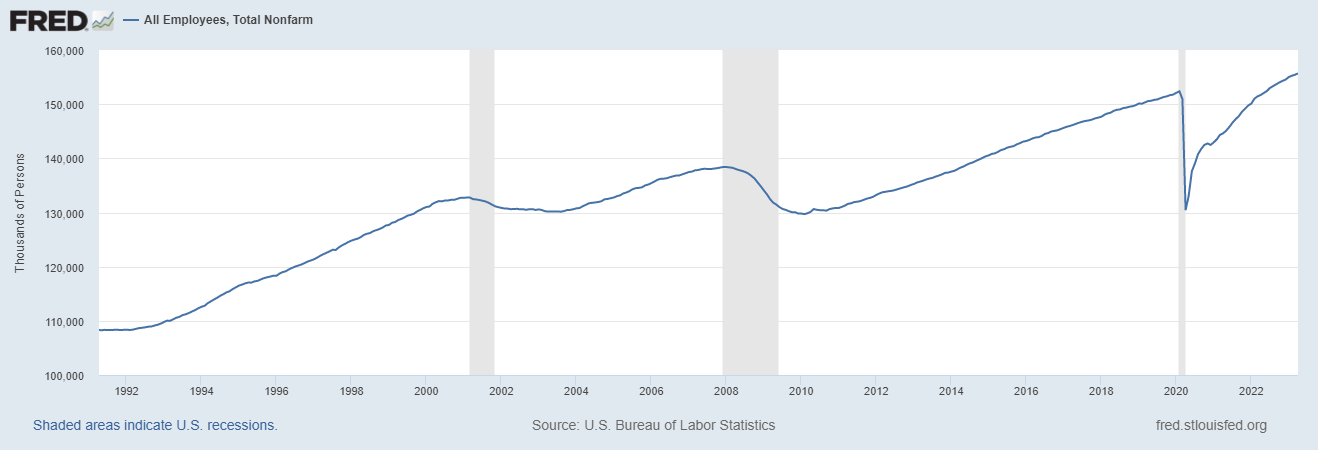
The yield curve is currently inverted, and it has been since July 2022. The general measure of inversion is the spread between the ten-year yield and the two-year yield. Here's an illustration of that spread since about 1996 (note that the curve was inverted, illustrated by the spread between the ten-year and two-year yields dropping below zero, prior to the recessions that began in 2001 and 2007, depicted by the areas shaded in gray) :


In summary, we've discussed the three theories that determine the shape of the yield curve. We've established that a "normal" yield curve is upward-sloping, with long-term yields higher than short-term yields. We've also established that when the market anticipates economic weakness, it assumes the Fed is going to cut rates, and thus long-term expectations are for lower rates, even if short-term rates are still increasing, which can result in an inverted yield curve.

What we can derive from this is that an inverted yield curve is a leading indicator of a recession. In fact, nearly every recession in the U.S. has been preceded by an inverted yield curve. It's vitally important to note that this is not a cause-and-effect relationship: an inverted yield curve does not cause a recession; it results from market participants' expectations that there will be a recession, and how the Fed will respond to it in its policy actions.

Armed with this information, in our next installment we'll turn to a discussion of inverted yield curves and recessions, some erroneous conclusions about other yield curve signals as they pertain to impending recessions, and another misconception about leading indicators of recessions.

Sunday, May 7, 2023

Bonds, the Yield Curve, and Recession Indicators - Part I: Bonds

Okay, I want to address some fallacious notions about what the Treasury yield curve tells us about the likelihood of a future recession and how "imminent" one might be, as well as some related topics about recession indicators. But first, I need to explain what the yield curve is, and why it looks the way it does at various times. (Technically, I'll be addressing the theories behind the term structure of interest rates, but don't get hung up on that - that sounds very technical, but it's pretty straightforward. Just think of it as, "Why does this graph look like this, and what is it telling me?")

Before I talk about the yield curve, I need to briefly discuss bonds. We're going to take all this in three installments, so as to not overwhelm. For today, we'll just stick with bonds.

Bonds are basically loans - they're obligations to repay money at some point in the future, with interest. Ford Motor borrows money from investors by issuing bonds that investors then purchase (those are corporate bonds, because they're issued by a corporation). The bond is a promise to repay the money. The bond has a maturity - for example, there's a currently outstanding Ford Motor Co. bond with a maturity date of Jan. 15, 2043. It was issued in Jan. 2013, so it was originally a 30-year bond. Thus, Ford was borrowing money for 30 years. The interest rate, or coupon, is 4.75% per year, paid every six months, with the principal paid at maturity. If you bought $10,000 of that issue, you'd get $237.50 every six months (4.75% x $10,000 / 2, since the interest rate is annual and you're getting paid semi-annually), and at maturity you'd get $10,237.50 (your principal back, plus the final coupon payment).

For now, we won't get into structured bonds like callables, or variable-rate bonds, or mortgage-backed bonds. So it's pretty straightforward: you get periodic interest (coupon) payments, and principal at maturity.

Bond market joke: What's the difference between men and bonds? Bonds mature.

Municipal bonds work the same way, except they're issued by municipalities (cities, counties, etc.) to fund schools, roads, libraries, etc. (In many cases, the interest investors receive is tax-exempt, but don't worry about that for our purposes.)

Corporate and municipal bonds carry ratings assigned by ratings agencies like S&P, Moody's and Fitch, based on the creditworthiness of the issuer, or borrower. It's like their credit score, and as with a credit score, the lower the rating (i.e., the less creditworthy the issuer), the higher the coupon. For example, AA-rated corporate bonds (a high rating) currently yield about 4.45%. BBB-rated corporate bonds (the lowest investment-grade rating; anything rated lower is considered a "junk" bond) yield 5.44%. The investor is taking on more risk that the less creditworthy borrower could default at some point before the bond matures, so he should get compensated more for that risk.

U.S. Treasury bonds also work the same way, paying interest every six months and principal at maturity. (Shorter term instruments called Treasury bills work differently, but we're not going to talk about them.) They carry the highest possible rating, because they're backed by "the full faith and credit of the U.S. government." Meaning that the government will always pay the interest and principal, because they can just tax us all to the deuce and back to get the money to do so. Because of their perceived high credit quality, their yield is lower than corporate bonds; currently, the yield on the 30-year U.S. Treasury bond is about 3.75%, or about 70 basis points (bp) less than a high-rated corporate bond of similar maturity (recall that a basis point is 1/100th of a percent).

In fact, all other bonds are priced off Treasury bonds; the yield on Treasuries is known as the benchmark, and the difference between the Treasury yield for a given maturity and the yield on corporate or municipal bonds of equal maturity is the spread. (There are other types of bonds besides the structured varieties I mentioned, most notably agencies, which are issued by various government entities, but again, that doesn't matter for our purposes - it's just informational.)

Let's talk about yield for a minute. The coupon is the stated interest rate on the bond; it determines the amount of the periodic interest payments. In our Ford Motor example, the coupon was 4.75%, and the reason we got $237.50 every six months on our $10,000 investment was a function of the coupon times the principal amount, divided in half due to the payments being made twice a year.

The yield is a function not only of the coupon, but, to a larger extent, the price paid for the bond. If the price paid is par (100 cents on the dollar), the yield will equal the coupon rate. If the price paid is more than par, the yield will be less than the coupon rate, because the investor paid more than he's going to get back at maturity, and that offsets the coupon interest to a degree. If the price paid is less than par, the yield will be higher than the coupon rate, because the investor paid less than he's going to get back at maturity, so the "gain" at maturity is added to the coupon rate to produce the yield.

A simple example is that an investor might, due to prevailing market conditions, pay $11,000 for that Ford Motor bond, and only get $10,000 back at maturity. Or, he might pay $9,000 for the bond, and he'll still get $10,000 back at maturity. The investor always receives par at maturity, except in the case of some structured bonds. (I'd give a more detailed example, but I'd have to show you the yield calculation, and I don't want to burden you with that.) We'll discuss why an investor might pay more or less than par for a bond in a few paragraphs.

I've noted this before, but it's important to remember that as bond prices go up, bond yields, and thus market interest rates in general, go down, and vice versa.

Now let's talk about Treasury bonds in more detail. Because they're so highly rated, investors prefer them for safety. For that reason, any time there's a significant event that spooks investors, they flood money into Treasuries. As a result of all that purchasing demand, the price of Treasury bonds goes up that day, and thus the yield goes down.

That's known as a "flight to safety" or "flight to quality."

Now, I recently read an opinion on social media that a daily change of about 8bp on the ten-year U.S. Treasury note (we'll talk about the various maturities when we discuss the yield curve) was "huge," and that bonds "normally move in very small increments."

This simply isn't true. There have been considerably larger moves in the ten-year note yield in the past several years: in March 2022 (related to the Ukraine invasion by Russia), in November 2022 (related to an unexpected inflation print), and back in September 2021 (related to a large move in stock prices). The recent 8bp move was related to irrational fears, spread by the media, over systemic risk in the U.S. banking system, which produced another flight to safety as investors shed bank stocks.

Flights to quality are not that uncommon, especially with the media sensationalizing everything and "experts" on social media spreading rumors and conspiracy theories left and right. But an 8bp drop in the 10-year yield (or even an 18bp drop in the 2-year yield, which happened the same day) is far from unprecedented, or even abnormal. If you wanted to see big changes in Treasury yields, you should have been around the bond market in 2008-09.

While it's true that the average daily change (up or down) in the 10-year yield, since 1962, has been about 4.3bp, the daily change has exceeded 8bp nearly 1,000 times since 1000 alone. Thus far in 2023, it's exceeded that amount more than 30 times. And the 2-year yield has changed by more than 18bp eleven times this year alone. The point of this is that large daily moves in bond yields are not uncommon, and I don't want anyone to be misled into thinking that they are. It happens fairly regularly, for a variety of reasons.

To close out today's discussion, we'll look at the different maturities of U.S. Treasury debt:

  • 1-month Treasury bill, or T-bill
  • 3-month T-bill
  • 6-month T-bill
  • 1-year T-bill
  • 2-year Treasury note
  • 3-year Treasury note
  • 5-year Treasury note
  • 7-year Treasury note
  • 10-year Treasury note
  • 20-year Treasury bond
  • 30-year Treasury bond
The various maturities are auctioned periodically to issue new debt. Issues that have already been sold into the market at auction are said to be "trading secondary," or trading in the secondary market (as opposed to the new issue or auction market). The price at auction is fixed at par according to prevailing market rates; the price of secondary issues fluctuates as market rates change relative to the bond's coupon.

Don't get hung up on this, but here's an example. Let's say a 10-year note is issued at par (100 cents on the dollar) with a coupon of 4.00% in October, 2008, because that's what the market yield on the 10-year was then. A couple of months later, in December 2008, an investor wants to buy that note in the secondary market. He's going to have to pay a lot more than par. Why?

Because the prevailing yield, or rate, on the 10-year note in December had plunged to just over 2% (remember what I said about big swings in the bond market in 2008-09?), so to receive 4% interest payments every six months in a 2%-yield market, he's going to have to pay a premium. (The amount paid above par is called the premium; it's necessary to bring the yield - which again is a function of the coupon payments and the price paid - in line with prevailing market yields. You pay more up front, which reduces your return, since you only get par back at maturity. But you get 4% interest, when the market is at 2%. So your yield is 2%; the 4% coupon interest is reduced by the premium you paid up front.)

Conversely, let's say the same investor buys a newly issued 10-year note in December 2008, which would have a coupon of about 2%, since that was the prevailing yield. He goes to sell it six months later, in June 2009, when the 10-year yield is back up to around 4% (there are those big swings again!). Now, to get the buyer to accept a 2% coupon in a 4% market, he has to sell the note for less than par, or at a discount (the discount is the amount paid less than par). The buyer's return, or yield, is 4%; the 2% interest is supplemented by the fact that the buyer pays less than par at purchase but gets the full par amount back at maturity.

If all that is as clear as mud, like I said, don't get hung up on it. It's not that important for our subsequent discussions. For now, the main focal points are these:
  1. When bond prices go up, yields go down, and vice-versa
  2. The Treasury market consists of the 11 maturities listed above, which make up the term structure of the yield curve (we'll introduce and illustrate that in the next installment)
  3. Besides the bills, the most important maturities are the 2-year, the 5-year, and the 10-year; we'll explain why in the next installment.
A final point: for our purposes, we'll be using the term "bonds" to describe both notes and bonds. They all make up the bond market.

Saturday, May 6, 2023

The Truth About the Banking System

If you watch the news, or are on social media (and I know you are, or you probably wouldn't be reading this), you've no doubt by now learned that there is a systemic banking crisis underway in the U.S.

Balderdash.

I know, I know - I said this more than six weeks ago, and now another "big" bank has failed, and you're thinking, "Aha! The Curmudgeon was wrong! The media was right!"

Now, I'm not saying I'm never wrong. But I can confidently say that there will never come a day when the media is right and I'm wrong about anything related to the financial system, because there aren't four people in the media who fully understand the financial system, and the vast majority of them don't know a liability from their ass(et).

I heard one pundit on one of the major cable news outlets say, "I don't believe in one-offs, and I certainly don't believe in three-offs." (Referring to the fact that three U.S. banks have now failed this year.)

Well, for the record, neither do I. However, consider this: there are more than 4,000 banks in the U.S. Some of them are poorly managed. Poorly managed businesses may fail. Heck, there are more than 600,000 restaurants in the U.S. and 30% of them will go out of business in their first year. So is there a systemic food service crisis in the U.S.?

Here are the facts (pesky as they are): since 2000, 564 banks have failed in the U.S. That's an average of about 25 banks per year. But it's heavily skewed by the financial crisis of the mid to late 2000s; 25 banks failed in 2008, 140 in 2009, 157 in 2010, and 92 in 2011. From 2012 through 2014, at least 18 banks per year failed, a residual effect of the crisis.

In 2018, 2021, and 2022, not a single U.S. bank failed. Three have failed thus far in 2023. Let's put that in perspective.

In 2020, four banks failed: one in February, one in April, and two in October. Also in 2019, four banks failed: one in May, two in October, and another in November.

Now, in October 2019, when those two banks failed in the same month, do you recall the media and every self-proclaimed financial expert on Facebook screaming at the top of their lungs about a systemic banking crisis? Then redoubling their squawking when yet another bank failed the following month? Then another just three months later, and another two months after that?

The horror.

The fact of the matter is, banks are businesses, and some businesses fail. Three failures out of an industry of 4,000 institutions is a very good track record. Yes, banks are different in that they hold your money. That's why we have deposit insurance. No depositor lost a dime in any of those failures since 2000. In fact, no depositor has ever lost a penny of insured deposits since the FDIC was created in 1933. (You and I, the taxpayers, have seen to that when there's been a crisis, and fortunately those have been very few and far between.)

"But," you say, "it's not just these three banks. The media is saying that there are more banks that could fail."

First, if you haven't learned by now that the media's job is to scare you, with hype and hyperbole, or that they don't have the first foggy notion of what the financial system is all about - well, I can't help you. Look up; somebody painted "gullible" on the ceiling.

Second, yes, there is a list of "problem banks." Guess what? There always has been. The FDIC maintains a list of banks that are rated 4 or 5 on its five-point "CAMELS" rating scale, 1 being best and 5 being brain-dead. (CAMELS stands for Capital adequacy, Asset quality, Management, Earnings, Liquidity, and interest rate Sensitivity.) I personally saw the list that the savings and loan regulator maintained back in the late '80s when I was an S&L examiner.

Regulators examine the banks, and rate them on those factors. Do they have enough capital to absorb anticipated and unanticipated losses? (In my current job, part of the analysis I perform for my clients is to calculate their capital adequacy in a near-worst-case, 1 in 20 years loss scenario.) Is their asset quality high (meaning, are the loans they make going to repay, or are a large percentage of them likely to default due to poor underwriting and credit management)? Is their management team strong? Do they have sufficient earnings to build additional capital and remain viable? Do they have enough liquidity, including access to contingent liquidity sources (like borrowing from the Fed or other sources, issuing deposits to non-customers through brokers, selling assets, etc.) to ensure they meet ongoing demands for deposit withdrawals and loan growth? And finally, is their balance sheet structured such that they won't incur significant losses - either realized or unrealized - due to interest rate fluctuations?

The C, A, E, L, and S components are largely about risk management, and that's what I advise financial institutions on for a living. And I can tell you that the trends I'm seeing in risk-adjusted capital adequacy and asset quality (loan delinquencies and charge-offs) are sufficiently strong that no one should be losing sleep. And that's across a fairly broad cross-section of clients, from coast to coast and from Texas to northern Ohio. I'll get back to the trends in earnings, liquidity, and interest rate sensitivity momentarily.

The chart below shows the number and combined total assets of banks on the FDIC's "problem bank list." It only goes through 2021, but you get the trend.


We are not spiking back up to 2009 levels this year - not even close. At the end of 2022, there were 49 banks on the list; it actually declined to 46 as of March 31, 2023. Total assets of those institutions on the list were $49 billion. A year ago, there were 54 banks on the list (March 31, 2022).

Now, let's note a few things. First, just because a bank is on this list doesn't mean they're going to fail. They may get new management and come out of the problem situation(s) that landed them on the list to begin with. (That management change may be by their own choice, or forced upon them by the regulator.) Or, they may merge with another, healthier institution that can absorb the problems (the benefits the acquiring institution gets include an expanded customer base, maybe an expanded branch footprint, and possibly additional capital, even if it's meager). There's another way that a bank may come off the list and move up in the CAMELS ratings. I'll address that after we discuss earnings, liquidity, and market sensitivity.

Second, the 46 banks that are on the list today is a number about equal to the 51 that were on the list in 2021, per the graph above. So we're not trending upward in terms of problem banks. In fact, the graph shows that that number has been stable since late 2018, fluctuating between 51 and 60, and much lower than in previous years.

Bank balance sheets today are as strong as they've ever been. Tier 1 capital - core or primary capital that is the foundation of a bank's strength - is higher now than it was a year ago, and since 2020 Q2 it's been above 14% of risk-weighted assets. From mid-2013 through early 2020, Tier 1 capital never got higher than 13.4% of risk-weighted assets. So the banking industry is in a stronger capital position today than it's been in the last ten years. (And note that the denominator is risk-weighted assets, meaning that the value of those assets has been adjusted for their risk according to a formula. So the Tier 1 capital ratio is already adjusted for risk.)

What about asset (loan) quality? The delinquency rate on all loans for all commercial banks in the U.S., aggregated, was 1.19% of total loans at the end of 2022. In other words, 1.19% of borrowers were late on their payments. (That doesn't necessarily mean that those loans will have to be charged off, either. The borrowers may become current on their loans, there could be timing differences in the payments vs. the due date, or the banks may restructure the loans so that the borrower can meet their obligation without default and charge-off. Also, since residential and many commercial loans are collateralized by real estate, the bank can foreclose and sell the collateral. Even with real estate values declining over the last several months, in many cases the lender could make a profit by charging off the loan balance and selling the house, which is probably worth much more at this point than what's owed.)

To put that 1.19% delinquency rate in perspective, it was 7.40% at the height of the 2008-09 financial crisis, and it was 1.60% in late 2020, coming out of the pandemic shutdown. In fact, 1.19% is the lowest delinquency rate for bank loans since the data has been reported, beginning in 1985.

The charge-off rate on bank loans (balances charged off divided by the average balances of loans on the books) was up a bit as of the end of 2022; it was 0.33% of average loans, vs. 0.19% at the end of 2021. That's not a big increase; again, for perspective, the charge-off ratio was 0.55% in mid-2020, and it's currently lower than it's been at any time since 1985, except for the previous seven quarters.

Yes, I know; those are year-end 2022 numbers, and this is 2023, and three banks have failed. So you're thinking there's been some massive spike in bad loans since the end of last year, right? Well, think again. I just finished reviewing the 2023 Q1 financials for all my clients, and the trend I'm seeing is a slight increase in the charge-off ratio (and by "slight," I mean very, very small), but a decline in the delinquency rate.

How can that be, you ask? How can delinquent loans be declining at the same time charge-offs are increasing? Easy - first, there's a lag between a loan becoming delinquent and when it gets charged off. The lender first exhausts all efforts to collect, or restructure the loan so the borrower can become current. Then, if it's a secured loan, they have to repossess and sell the collateral. Only after they've recovered that amount would they charge off the remaining balance, and even then they may send it to a third-party collector to try to recover the funds, in which case at some future date the recovered amounts would offset that period's balances charged off. It takes even longer to foreclose on a house and sell it; in some states the law requires the lender to wait two years before they can foreclose. So today's charge-offs might be the result of loans that went delinquent as much as two years ago.

Finally, there were a number of forbearance programs put in place during the pandemic to prevent lenders from placing borrowers in default status, foreclosing on real estate, and charging off loans. (Brilliant, right? The government shuts down the economy, forcing tens of millions of people out of work. Then, because they can't make the payments on their loans, the lenders have to wait until the forbearance programs expire to collect on the unpaid debt. And you wonder why banks get in trouble.) Those forbearance programs have finally expired, and so some of the charge-offs today represent loans that went delinquent in 2020, but were placed in forbearance.

Okay, it's time to talk about earnings, liquidity, and interest rate sensitivity. Those factors play into the reasons for the failures of the three banks that have been seized in 2023. Earnings are compressed for banks because of rising interest rates. This happens because, as rates rise, they have to raise rates on their deposits, the vast majority of which are demand deposits (savings accounts) vs. term deposits (CDs). So the amount of interest expense they have to pay on those deposits is going up.

At the same time, their loans are longer-term, and mostly fixed-rate. The average auto loan takes about three years to pay off (at which time the borrower either pays off the loan outright, or buys a new vehicle and pays off the loan with the sale of the original vehicle). Mortgages are even longer-term; the average duration of a 30-year mortgage is around ten years. So at the same time their interest expense is going up, most of their interest income is flat.

Let's look at examples. The rate banks pay on 3-month CDs has increased from 0.10% in September 2021 (on average) to 4.91% today. That's a huge increase in interest expense. Meanwhile, the average 30-year mortgage rate in September 2021 was less than 2.90%. So banks are paying nearly 5% on short-term deposits, and they're still earning less than 3% on mortgages booked before rates started going up.

And there are two things preventing them from replacing those 2021 mortgages with higher-earning mortgages (today's 30-year fixed mortgage rate is nearly 6.4%). First, nobody is prepaying those 2021 mortgages. Would you prepay a loan with an interest rate below 2.9%? You certainly can't refinance the loan (unless you desperately need to pull equity from your house, in which case you could just take out a much cheaper home equity loan). And second, there's hardly any demand for mortgage loans today, compared with the last several years. Nobody is refinancing, and home sales have fallen by about 30% since late 2021.

When the interest rates banks must pay on deposits is rising rapidly, and the interest rate they're earning on long-term assets is flat, that's known as a margin squeeze. And the result is a decline in earnings. So banks' earnings, in aggregate, are down compared with the last few years. They can't make it up with fee income, either; the trend in the industry is toward eliminating or drastically reducing most fees. (One of my clients, a large credit union, has eliminated about 70% of its fees over the last two years.) The decline in fees is driven in large part by concerns over actions being taken by the Consumer Financial Protection Bureau (CFPB) (an agency with no oversight, by the way) to assess massive fines against financial institutions for what it deems as unfair fees. And it makes those determinations with impunity.

Liquidity has also been a challenge for banks for the last year or so. From the top down, the Fed has pulled about $300 billion from the market by reducing the size of its balance sheet, after increasing it dramatically to stimulate the economy after the pandemic shutdown. On a more micro level, as rates have risen, depositors have pulled money out of banks and put it into higher-yielding money market funds, or into the stock market. At the same time, demand for loans remained strong through the end of 2022; while mortgage demand began to decline around mid-year, other lending types remained brisk. Many of my clients saw negative deposit growth throughout 2022, and record loan growth. For the credit union industry as a whole, just a small part of the financial institution industry, deposits only grew by 3.3% in 2022, the lowest rate since the 1980s, while loans grew by 19.1%, the highest rate over that same period. In dollars, deposits increased by about $61 billion from 2021, while loans grew by $244 billion. So the industry took in nearly $200 billion less than it lent out. That's a massive liquidity crunch.

Finally, sensitivity to interest rates is always going to be a challenge in an environment in which the Fed increases short-term interest rates by 500 basis points, or five percentage points, in about a year. That hasn't happened since the 1980s, either. The most recent round of Fed tightening (raising rates) has been the most aggressive in nearly half a century.

So those three factors have been a challenge for all financial institutions. Fortunately, the other factors - capital adequacy, asset quality, and management - have been, for the most part, strong enough to counter those challenges, and the industry as a whole is in a very strong position today.

That's not the case for every bank, however. Silicon Valley Bank was poorly managed, and was doomed to fail by its bad decisions, which included a failure to hedge its interest rate risk, which was excessive due to the way it structured its investment portfolio, and a huge concentration of very large uninsured deposits, which are more likely to lead to a liquidity crisis if those depositors start withdrawing their funds. That latter point also plagued Signature Bank. (Here's a recap of those failures: https://theeconomiccurmudgeon.blogspot.com/2023/03/is-banking-system-safe.html).

As for the most recent bank failure, First Republic, it too suffered from severe liquidity stress, and has been on the brink of failure since SVB and Signature Bank went under.

Are there more banks that will fail? Probably, as the trifecta of a margin squeeze, tight liquidity, and interest rate risk will prove to be the undoing of institutions that aren't well-managed (that's four of the six factors of the CAMELS rating system that would be negative, for those institutions). When rates were low and stable and liquidity was ample, those institutions were able to get away with bad management, and took on too much risk. They were incented to do so by the Fed slashing interest rates to zero, which wouldn't have been necessary (and probably wasn't anyway) if the government hadn't shut down the economy due to covid, which definitely wasn't necessary. So, just like the S&L crisis, this situation resulted from government policy.

The good news is that the vast majority of institutions are well-managed. So even though the three factors mentioned above are a challenge for the entire industry, they're not insurmountable.

I promised that I'd mention another way that a bank can move off the FDIC problem bank list after we talked about earnings, liquidity and market risk. And that's to just stay the course until conditions normalize. For many institutions, what put them in the position they're in has been this environment of rapidly rising interest rates and tight liquidity. So when those conditions normalize, those institutions' health will improve.

When will that happen? When we have a recession. The Fed will begin cutting rates, so rates will go down. Combined with home prices reverting to normal, which is already happening, that will make homes affordable again, and mortgage demand will resume. But first, loan demand overall will decline, since people generally avoid borrowing money during an economic downturn, due to uncertainty over their ability to repay if they were to lose their jobs. And savings balances will grow, as people exit the stock market and move their money into safer, insured deposits. So the liquidity crunch, the margin squeeze, and the interest rate risk will be resolved, albeit painfully for the broader economy.

All of this is likely to happen relatively soon, as I'll address in the next post. For now, let me make two final points.

First, many people might say, "Yes, only three banks have failed this year, but their combined assets are more than the total assets of banks that failed in 2008!" And why wouldn't they say that? The media is shouting it from the rooftops: "Recent bank failures eclipse 2008 levels!" (Never forget that the media sells hype, and that business journalists are, by and large, morons.)

As I noted in the post linked above, we need to consider asset growth since 2008. Yes, SVB, Signature Bank and First Republic, when seized, had combined total assets of over $548 billion. And yes, that's more than the $374 billion in assets of the 25 banks that failed in 2008. However, to compare apples to apples, we have to look at how large the three banks that have failed this year were in 2008. The answer: less than a combined $47 billion in assets. That's only about 12.5% of the magnitude of the bank failures in 2008. Not one of those three banks was as large in 2008 as the two largest banks that failed that year - not even close.

My final point is this: if you believe that social media hasn't played a role in this year's bank failures, you're a Pollyanna. With the advent of meme stocks and APE investors (you know, those people who think that companies like GameStop and AMC are great stock buys, and actually think they understand the financial markets), there are a lot of people slinging around opinions on Facebook as if they knew what they were talking about.

Simply put, they don't.

Some of them are my friends, and I just have to shake my head and chuckle at how ill-informed, and just plain wrong, they are when they opine about all things financial. (I'll address another such fallacy in my next post.) That stuff spreads like wildfire, and their equally ill-informed friends gobble it up, because, "Gee, Jim's a smart guy, he must know what he's talking about, he works for a bank, after all." (Never mind that Jim works in HR or IT, and doesn't really understand how interest rates move, or how markets work.) So the friends share those posts with their friends, who ... you know how it works.

Twitter, in fact, is known to have led to the run on deposits at Signature Bank. Not that Signature didn't deserve to fail, but the deposit run wouldn't have happened without social media.

Here's all the proof you need that social media has played a role in spreading fear over an imminent banking crisis, and leading to unnecessary deposit withdrawals that threaten to turn those dire - if wrong - warnings into self-fulfilling prophecies:

The only place I've seen the claim that social media didn't contribute to any of these bank failures, is on social media. Let that sink in.